
I just watched a full-length documentary film about a font. And I loved it. So much that, right now, I’m supposed to be filling out a ballot for tonight’s Oscar party, but I’m distracted by the total lack of support this feel-good flick received from the nominating committee.
The film’s protagonist, the modern and good-natured typeface called Helvetica, has been lavished with worldwide attention for more than fifty years — though most of us couldn’t name the font when we see it. Which we constantly do. As more than one of the interviewed type designers noted, since its creation in Switzerland in 1957, Helvetica has become “like air.” “It seems like gravity.” It’s everywhere.
Despite its rational, easy-going demeanor, Helvetica inspires passion — sometimes adoration, sometimes derision — in those who know it well. (Granted, many of these folks are a little strange, like the type designer who excitedly declares, “Some people like looking at girls’ bottoms. I get kicks out of looking at type.”) About Helvetica, one designer says, “There hasn’t been such a hot thing since.” Many think of it as the typeface that can do no wrong. But another professional counters that, as a young designer, she was “morally opposed to Helvetica,” and even goes on to joke that the font, because of how it has been favored by the government, caused the Iraq war.
It seems that almost every word lover and design geek has something (often something unintentionally funny) to say about Helvetica and, sometimes, about the font’s notable participation five decades of global culture.
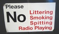
In between interviews and anecdotes, producer-director Gary Hustwit serves up all manner of international slogans and signage — from subways, buses, street signs, storefronts, postage stamps, album covers, and countless companies from Toyota to Target to Tupperware — all featuring Helvetica. For someone like me, who collects abandoned street signs and compulsively picks up torn scraps of language from the sidewalk, this is a quick trip to paradise.
Of course I can’t do anything about the Oscars and, truth be told, I’m not a even a big fan of Helvetica, the font. I’m much more fond of the elegantly serifed Georgia. (And I was oddly thrilled to see the film’s interview with Matthew Carter, the designer of Georgia, Verdana, and numerous other type styles.) But in honor of Helvetica, the film, I’ve hacked my blog to present this post in the appropriate typeface.
You can rent “Helvetica” from Netflix, or directly support the filmmaker by purchasing the DVD at www.helveticafilm.com. I’m ordering my t-shirt now.